A strong and recognizable brand can help a business be more successful, which is why creating an effective brand identity is so important. In 2025, The Borgen Project launched its new brand identity, so to ensure that your posts are posting-eligible, please use the guide below.
Happy Designing!
Branding Details & Design Tips
Guidelines
- Mission Alignment: Ensure all content aligns with The Borgen Project’s mission to advocate for global poverty alleviation. Your designs should highlight issues such as foreign aid, poverty reduction, and global justice.
- Text: Keep all text concise (a few words or short sentences). The goal is to capture attention quickly.
- Call-to-Action: Every infographic should include a clear call-to-action
(e.g., “Contact your Leaders Today,” “Donate Now,” etc). - Visuals: Use impactful visuals or icons that complement the message. Avoid clutter—ensure there is ample white space for a clean design. Ensure your visuals align with the font guidelines and brand colors.
The official Borgen Project brand guidelines can be found here, however, here are the highlights:
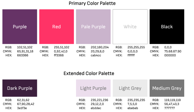
Brand Colors:
Downloadable Logos
Need to use one of our logos? Here you can find all the various designs.
Layout Guidelines
- Use grid-based layouts for balance and organization.
- Ensure that the most important information is prominent and easy to find.
- Contrast is key: ensure your text stands out against the background – you want your text to be easy on the eyes and easy to read.
- Stick to brand colors.
Image and Graphic Guidelines
- Use high-quality, relevant images. Avoid using too many stock images; use custom graphics whenever possible.
- Incorporate icons or illustrations to represent key ideas.
- Avoid too much text—let the visuals and call-to-action speak for themselves.
Alignment and Format
- Different social media platforms have different size posts. Ensure your infographic caters to this. For example, Instagram infographics are typically square.
- Leave room for the post’s caption and hashtags, but don’t rely on them—ensure the graphic can stand alone without too much text.
Useful Resources:
This page will also help with importing specific fonts into Canva. Fonts can be found here and here.
QR code generator + free QR code traffic tracking: https://is.gd
If you want to use an image in your infographic, use the sites below or sites that allow image usage (creative commons or no rights reserved photos). Photos before the 1920s are safe to use, so feel free to get creative. Photographs on any U.S. government site are public domain, so check out sites like USAID, CIA World Factbook, whitehouse.gov, etc. Photos on any UN websites are open source as well.
- Flickr*
- Pixabay.com
- Google Images
- Flickr Creative Commons
- Wikimedia Commons
- Unsplash
- Free For Commercial Use
- BigFoto.com
- MorgueFile.com
- FreeMediaGoo.com
- Everystockphoto.com
*When choosing photos from Flickr, please do not use photos with the label “All Rights Reserved.” Photos with the label “some rights reserved” are okay to use.